10 Points to Make PowerPoint Presentation More Interesting?
1. Identify and then tell the story
When we give a presentation, we are doing it to tell a story that has one or two goals. We are trying to inform the audience about something we know that they don’t, we are trying to persuade the audience to adopt a view that we have or a combination of the two. We need to identify the beginning, middle, and end of the story that accomplishes our goals and then use the presentation to tell the story. A presentation should not just be a data dump. If our goal is just to provide data, then we would be better off canceling the presentation and just sending out the data. The presenter is providing a perspective that the data cannot provide, by itself.
2. Do not present too much information
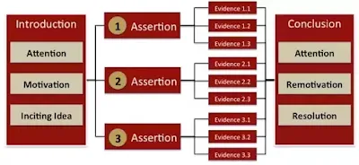
Dating back to Aristotle, speakers have known that an audience will only walk away remembering a few ideas from a speech. Aristotle called this the “Rule of Three”. Pick three ideas you want to present and present those. Each of those might be broken into three parts to explain, but don’t bother adding a fourth main point, because they won’t remember it. For a modern example, look at the Apple presentations given by Steve Jobs – they were always structured around the “Rule of Three”.
3. Do not add content unless it supports your main points
The slide is a canvas used to paint your story. There should be nothing on the slide that is not working to tell the story. Extraneous details in templates, graphs, figures, and tables should be removed. The process of absorbing and using information is called cognitive loading. Extraneous details use up cognitive load and make it harder for the audience to follow along and learn.
4. Do not use PowerPoint as a teleprompter
Do not read your slides to the audience. Do not fill your slides with everything you need to say. Do not make the audience question what value you, the speaker, are adding to the presentation. The slides are for the audience, not the speaker. If something is on a slide, it is because it is needed to understand what the speaker is saying.
5. Use PowerPoint to clarify and amplify your message
The purpose of projecting an image on the wall, adjacent to the person speaking, is to provide a visual representation of the topics being spoken of. The visuals are to augment, not repeat, the words of the speaker. Slides should convey graphically what words cannot. If the words are so straightforward that they need no clarification or amplification, then don’t use slides.
6. Don't use PowerPoint for things it's not intended for
A slide is intended to augment a speaker – it is not intended to stand alone and serve as a document. PowerPoint slides should be viewed as ephemeral – only existing while the speaker is talking. A PowerPoint presentation is not supposed to be permanent documentation of a topic.
7. Never give out copies of the presentation
PowerPoint slides support the speaker – they are not supposed to stand alone. When we get in the habit of handing out copies of our presentation, we get in the habit of designing our presentations to be handouts. If they become effective at standing alone, they become less effective at supporting the speaker because they become crowded and repetitive.
8. Prepare a dedicated handout
Rather than giving out a copy of the presentation, prepare a dedicated handout that includes a combination of the most important visuals from the presentation with the most important words from the speech. Written in full sentence narrative, this handout would be able to stand alone and would still make sense to the audience, three months after the presentation. For some presentations, this handout might be simple as a one page summary of the presentation. For other presentations, it might be a full white paper that includes the supporting data that led to the arguments made in the presentation.
9. Involve the audience in the presentation
Whether your goal is to inform or to persuade, the goal will be more likely met if the audience has a participative role in the presentation. People don’t like to be talked to – they like to be talked with. Include questions for the audience. Solicit opinions and experiences from the audience. Turn the presentation into a guided discussion with visual support.
10. Ensure that the presentation is legible from anywhere in the room
Do not use fonts or graphics that cannot be comfortably understood from the back of the room. Most experts recommend not using a font size smaller than twenty-eight points. If you find yourself needing to go below twenty-eight, you have too much text on each slide.
by Robert Frost, Instructor and Flight Controller at NASA, on Quora


0 comments